Best-Selling T-Shirt Colors for POD (and How Many to Offer)
Best-selling t-shirt colors for print-on-demand, without made-up data: staple neutrals, garment-dyed and seasonal picks, contrast rules and how many to offer.
By the POD Made Easy team · September 24, 2026 · 8 min read
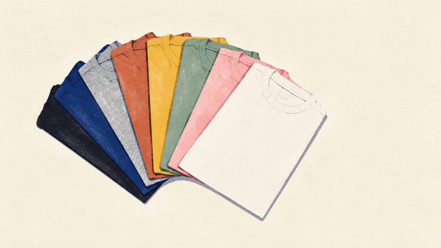
There’s no public, reliable ranking of print-on-demand sales by t-shirt color, so be wary of any precise “top 10 best-selling colors” list. What you can rely on: black, white, heather grey and navy are the staples almost every POD tee is offered in; garment-dyed and muted colors are all over Etsy search results for cozy, vintage and gift designs; and the color that sells a particular design is the one that makes it readable and suits its buyer.
This guide covers the staple colors and why they work, the common alternatives, how to match shirt colors to a design by contrast, how many colors to offer per listing (with the variant math for Printify and Etsy) and how to find your own best-selling colors from real sales data.
Key takeaways
- Start with the staples (black, white, heather grey and navy) plus one or two colors that suit the niche.
- Choose shirt colors by contrast with your design, not by popularity alone.
- Three to six colors per listing is a practical starting point for most designs (our rule of thumb).
- Printify caps a product at 100 variants, so sizes × colors sets your ceiling.
- Let your own data decide: check sales by color every season and cut colors that never sell.
The staple colors almost every POD shirt offers
Four colors appear on nearly every POD t-shirt listing because they suit almost any design, any buyer and any outfit:
- Black. Bright colors and white lettering pop on it, it goes with almost any outfit and it hides stains. Designs need light or saturated colors to show up.
- White. The best canvas for dark linework and full-color art. Remember that DTG printers don’t print white ink on white shirts, so white parts of your design disappear.
- Heather grey (called Athletic Heather, Sport Grey and similar names, depending on the brand). A neutral that works with both dark and bright designs, with a slightly softer print because heathers contain polyester.
- Navy. A softer alternative to black that suits outdoorsy, nautical and preppy designs. Watch dark-on-dark contrast.
The staples also tend to have the widest size range, which matters if you sell extended sizes. When we checked Printful’s catalog in September 2026, the Bella+Canvas 3001 came in 84 colors, but only 8 of them ran all the way to 5XL: black, white, navy, athletic heather, black heather, dark grey heather, red and true royal. Many fashion colors stopped at 2XL. Check the size run for every color you plan to list.
Garment-dyed, heather and pastel colors
Beyond the staples, three families of colors show up again and again in Etsy search results:
- Garment-dyed colors. These shirts are dyed after they’re sewn, which gives a washed, lived-in look. One example you’ll find in several POD catalogs is the Comfort Colors 1717: 100% ring-spun cotton, and 49 colors at Printful when we checked, with names like Pepper, Ivory, Butter, Moss and Blue Jean. Muted, garment-dyed shades suit retro, cozy and outdoorsy designs.
- Heathers. Heather colors blend cotton with polyester: the Gildan 5000’s heathers, for example, are 50/50, and its Sport Grey is 90/10. Printful notes that blends print softer and more washed out than 100% cotton, which suits vintage designs and works against bold, opaque ones.
- Pastels and naturals. Soft pink, mint, light blue, butter yellow and cream suit spring, baby, floral and gentle designs. They need dark or saturated artwork; white designs vanish on them. Some naturals have character: Printful notes, for instance, that dark speckles are expected in the Gildan 5000’s Natural color, which is worth mentioning in your listing.
Muted and garment-dyed palettes are a big part of vintage styling, which our guide to vintage and retro t-shirt design covers in depth.
Choose colors by contrast, not popularity
A design that disappears on the shirt won’t sell in any color. The key is value contrast: how light or dark the design is compared with the fabric. Hue matters much less. A quick test: turn your mockup to grayscale. If the design fades into the shirt, that combination won’t read from across a room.
| Your design is mostly… | Works well on | Avoid |
|---|---|---|
| Dark linework or black text | White, natural, pastels, light heathers | Black, navy, charcoal |
| White or cream artwork | Black, navy, forest, maroon, dark heathers | White, natural, light pastels |
| Bright, saturated colors | Black, white, heather grey | Busy heathers and shirts close to the art’s colors |
| A muted vintage palette | Garment-dyed neutrals, cream, sand, sage | Very bright or neon shirts |
| One ink color | Any shirt with strong contrast; make light and dark versions | Shirts close to the ink color |
The print process adds a few hard rules on top:
- No white ink on white shirts. DTG printers skip it, so add an outline or darker colors.
- Black ink looks gray on black shirts. The white underbase lightens it, so leave black areas transparent.
- Light inks can tint on red. Printful and Gelato both note that white or light ink on red and maroon garments may look tinted.
- Neon doesn’t print as neon. Screen neons are outside the ink gamut and print duller. Our guide to RGB vs CMYK for print-on-demand explains why.
The print method changes how colors land, too; see our DTG vs DTF comparison for how each handles dark garments.
How many colors should you offer per listing?
Etsy doesn’t publish an ideal number, and neither do the providers. Our rule of thumb: offer three to six colors that the design genuinely looks good on, including at least one staple. Every extra color means another mockup to make and check, another chance of a combination that disappoints in person, and a longer list for the buyer to scroll. A tight, curated set also makes a listing look intentional.
Then there are hard limits. Printify caps a product at 100 variants (sizes × colors), which sets your ceiling:
| Sizes offered | Number of sizes | Maximum colors within 100 variants |
|---|---|---|
| S–XL | 4 | 25 |
| S–2XL | 5 | 20 |
| S–3XL | 6 | 16 |
| XS–4XL | 8 | 12 |
| XS–5XL | 9 | 11 |
Printify’s limit is 100 variants per product at the time of writing. Colors that don’t come in every size use fewer variants.
On Etsy’s side, you can set individual prices and quantities for up to 400 variation combinations, and you can link photos to up to 20 options within a variation, so buyers see the right shirt when they pick a color. Printify also notes that Etsy listings it publishes can carry at most 20 mockups across all colors, which is another reason to keep the color list focused. See Etsy’s variations help page for the current limits.
Extended sizes cost more to make, so price them higher; our guide on how to price print-on-demand products covers size-based pricing.
Colors by season and niche
Seasonal designs sell better on shirt colors that match the occasion. These pairings are common-sense starting points, not sales data:
| Season or niche | Shirt colors to try | Notes |
|---|---|---|
| Fall | Garment-dyed browns, rust, mustard, moss, cream | Earth tones suit cozy and harvest designs |
| Halloween | Black, orange, charcoal | Orange and white inks stand out on black |
| Christmas | Red, forest green, white, heather grey | Check light inks on red for tinting |
| Valentine’s Day | Pink, red, white, cream | Use dark or saturated art on pale pinks |
| St. Patrick’s Day | Kelly or Irish green, white, heather grey | Green names vary by blank brand |
| Fourth of July | Navy, red, white, heather grey | Vintage flag styles suit heathers |
| Spring and Easter | Pastels, light blue, mint, butter | Use darker linework for contrast |
| Outdoors and fishing | Olive, sage, sand, heather | Muted shirts suit badge and lure designs |
For timing, our print-on-demand seasonal calendar shows when to list each season, and our fall shirt ideas put the autumn palette to work.
Show colors honestly in your mockups
- Lead with your best combination. Put the design on the shirt color where it has the strongest contrast for the first photo, because that’s what shows in search.
- Add a color chart. One image showing every available shirt color saves buyers from guessing.
- Link photos to colors. On Etsy, a photo linked to each color variation shows buyers exactly what they’re choosing.
- Preview realistic color. Printify’s Product Creator can show mockups in CMYK mode, which is closer to the printed result than bright RGB mockups.
- Set expectations. A line such as “colors may vary slightly from your screen” is honest and heads off disappointment.
Our Etsy mockup checklist covers the rest of the photo set, from lifestyle shots to size charts.
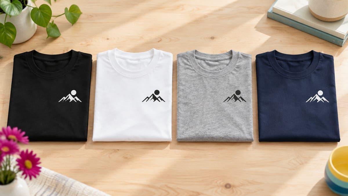
One design, the right shirt colors, one publish
In POD Made Easy’s product builder you pick your provider’s blank, choose the colors and sizes, place the design with a live DPI check, and publish the product to your Printify-connected store.
Start your free trialFind your own best-selling colors
General advice gets you started; your own data tells you what your buyers want. Check these once a season:
- Your Etsy orders. Every order records the variations the buyer chose, so a quick tally of colors per design shows you what actually sells. Pair it with listing views in Etsy stats.
- Printify’s analytics. The Product performance dashboard has a sales by product and color table for your own shop, and its Best of Printify dashboard shows the best-selling variants of a product among Printify merchants.
- Prune and test. Drop colors that haven’t sold on listings with healthy traffic, and try one new color in their place. If a listing has views but no sales at all, color is rarely the only problem; our guide to Etsy views with no sales covers the bigger fixes.
Try this idea in POD Made Easy
“Single-color white line art of a mountain range and pine forest under a crescent moon, designed for dark shirts, clean bold lines, isolated on transparent background”
Start with the staples, add the colors your niche expects, keep the list short and let your own sales decide the rest. That approach beats any generic ranking, including one we could have made up.
Frequently asked questions
- What is the most popular t-shirt color?
- There’s no public ranking of sales by color that covers the whole POD market. Black and white are offered on virtually every blank, with heather grey and navy as the other near-universal staples. For your own niche, check your sales data and Printify’s best-selling variants.
- How many color options should a t-shirt listing have?
- There’s no official number. Three to six well-chosen colors is a practical start: enough choice without dozens of mockups to maintain. Printify caps a product at 100 variants, so with six sizes you can offer up to 16 colors.
- Should I offer every color my provider has?
- Usually not. Colors that hide or clash with your design add mockups and returns risk without helping the design. Offer the colors it reads well on, and split light-shirt and dark-shirt versions into separate listings if needed.
- Do heather shirts print differently?
- Yes. Heather colors are cotton-polyester blends, and Printful notes that blends give a softer, more washed-out print than 100% cotton. That suits vintage designs; for bold, opaque color, choose solid cotton colors.
- Why is part of my design missing on a white shirt?
- DTG printers don’t print white ink on white garments, so white parts of your design simply show the shirt. Add an outline or make a light-shirt version of the design with darker colors.
Keep reading
More design guides
Design
Best Fonts for T-Shirts: 38 Free for Commercial Use
The best fonts for t-shirts that are free for commercial use: 38 Google Fonts checked for OFL or Apache licenses, by style, plus pairing and legibility tips.
Sep 24, 2026 · 14 min read
Design
Can You Use Canva for Print-on-Demand? License and Workflow
Yes, if your design is original. What Canva’s license allows on print-on-demand merch, what it bans, and the export settings that give you print-ready files.
Sep 24, 2026 · 10 min read
Design
Best AI Image Generators for T-Shirt Designs (2026)
The best AI image generator for t-shirt designs depends on the job. We compare 8 tools on text, transparency, resolution, vector output, rights and cost.
Sep 24, 2026 · 13 min read