RGB or CMYK for Print-on-Demand? Color That Prints True
RGB or CMYK for print on demand? Printify and Printful want RGB (sRGB) files. Here’s why, why prints look different from your screen, and how to fix it.
By the POD Made Easy team · September 24, 2026 · 8 min read
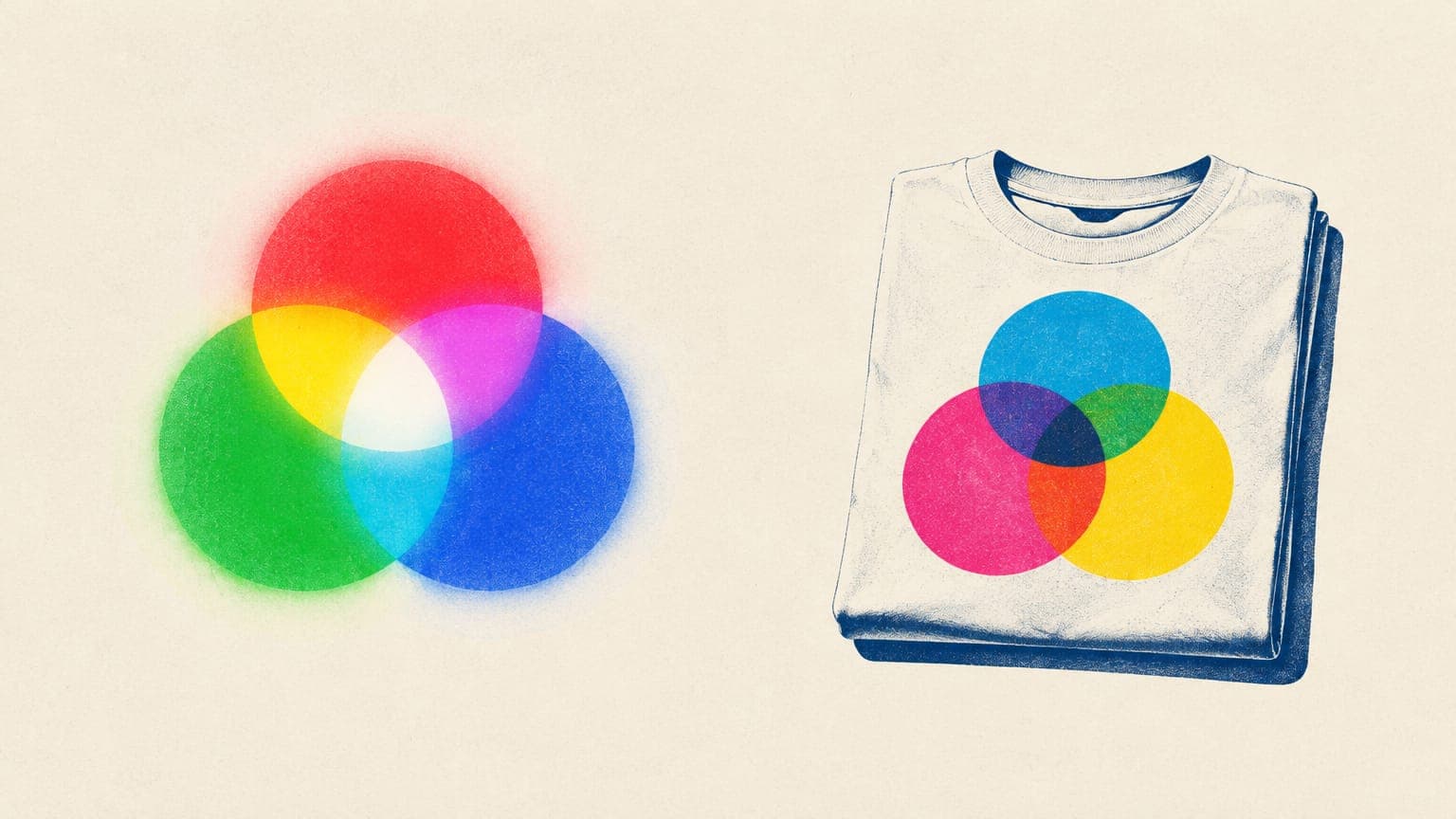
For print-on-demand, use RGB, and specifically sRGB. Printful recommends print files in the sRGB IEC61966-2.1 profile, Printify’s system works in RGB and converts CMYK uploads (which can shift colors significantly), and Gelato asks for sRGB files for DTG apparel. So is it RGB or CMYK for print on demand? RGB for the file you upload; CMYK only as a preview.
That surprises a lot of new sellers, because “print means CMYK” is standard advice for traditional printing. Below: why POD works differently, why your prints look different from your screen, which colors print reliably, and how to preview and export files so colors come out the way you expect.
Key takeaways
- Upload RGB (sRGB) files to Printify, Printful and Gelato; don’t convert to CMYK first.
- Use CMYK only as a soft-proof preview to spot colors that will print duller.
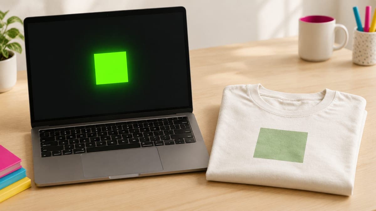
- Neon, very saturated and metallic colors can’t be matched in ink, so they print duller.
- Shirt color, fabric blend and the white underbase all change how colors look on garments.
- Order a sample when color matters: providers say they can’t guarantee an exact match.
RGB vs CMYK in plain English
RGB (red, green, blue) is how screens make color: by adding light. Full red, green and blue together make white. CMYK (cyan, magenta, yellow and black) is how traditional printing makes color: by layering ink that absorbs light. The more ink, the darker the result.
The two systems have different gamuts, or ranges of reproducible colors. A screen can show electric greens, hot pinks and glowing blues that no ink can match. Those colors are “out of gamut” for print, and the printer swaps them for the nearest color it can make.
sRGB is the standard RGB color space used by most monitors, phones, browsers and design apps, and sRGB IEC61966-2.1 is the name of its color profile. If you’ve never changed your color settings, you’re almost certainly designing in sRGB already. Wider spaces like Adobe RGB and ProPhoto RGB exist, but Printful advises against them for print files because they can cause unexpected color shifts.
What Printify, Printful and Gelato ask for
| Provider | Upload in | If you upload CMYK | Preview advice |
|---|---|---|---|
| Printify | RGB | Converted to RGB; colors may shift significantly | Preview in CMYK in your design app or the Product Creator, then export in RGB |
| Printful | sRGB IEC61966-2.1, as PNG or JPEG | Not recommended; it can reduce color information | Soft-proof with PSO Coated v3; avoid Adobe RGB and ProPhoto RGB |
| Gelato | sRGB for apparel, posters, canvas and mugs | Suggested only for brochures and stationery | Keep colors within the CMYK gamut and avoid neon |
From each provider’s help center, September 2026. Check the file guidelines for your exact product.
Why do POD printers want RGB when they print with ink? Printful explains that modern print workflows are built to take sRGB files and handle the color conversion themselves, and that some of its printing techniques use inks beyond the standard CMYK set. Converting to CMYK first throws away colors those printers could have used. Printify’s advice is similar: create in RGB, convert to CMYK in your design app only to preview the likely shift, then undo it and export in RGB.
Why your prints look different from your screen
Even with the right file, a printed shirt rarely matches the screen exactly. Printful and Gelato both say they can’t guarantee a 100% color match. These are the usual reasons:
- Light vs ink. Your screen glows; a shirt only reflects light. Printed colors almost always look a little less luminous.
- Out-of-gamut colors. Neon and very saturated colors are mapped to the closest printable color, which looks duller, darker or slightly shifted.
- Shirt color and the white underbase. On colored and dark garments, DTG printers lay white ink under the design, so the final color is a mix of your colors and that white. Our DTG vs DTF guide explains the process.
- Fabric. Printful says 100% cotton gives the boldest, most opaque prints, while blends and tri-blends look softer and more washed out. Gelato recommends hoodies and sweatshirts with at least 80% cotton for the brightest results.
- The print partner. Printify notes that each of its print partners runs its own color tests, so the same file can look slightly different from one partner to the next.
- Your own screen. Brightness, night-mode settings and uncalibrated monitors all change what you see, and phones and laptops rarely agree.
- Mockups. Printify’s Product Creator can show mockups in RGB or CMYK mode. CMYK is closer to the printed result, and the mode you choose is also used for the mockups sent to your store.
Colors that print well, and colors that don’t
Gelato publishes a short guide to how colors behave on its DTG printers. It’s a useful reality check before you build a palette:
| Color | Example | How it tends to print on DTG |
|---|---|---|
| Bright red, cyan, magenta, lemon yellow, sky blue | Pure or near-pure ink mixes | Bright and close to the screen |
| Deep orange | #FF6600 | Can shift toward red |
| Lavender and light purple | #CC99FF | Can look dull or pale |
| Pastel peach | #FFDAB9 | Can print flat |
| Neon green | #39FF14 | Duller: ink has no fluorescent range |
| Metallic gold | #D4AF37 | A flat, non-metallic color |
| Very dark navy | #0A0A2A | Can turn muddy or nearly black |
Summarized from Gelato’s CMYK DTG color guide. Results vary by printer and garment, so treat it as a starting point.
The garment adds its own rules, which Printful, Printify and Gelato all point out:
- White on white doesn’t print. DTG printers don’t lay white ink on white garments, so white parts of your design just show the shirt.
- Black on black looks gray. Because of the underbase, black ink on a black shirt can look grayish or glossy. Leave those areas transparent instead.
- Light inks on red can tint. White or pale ink on red and maroon garments may take on a tint.
- Colors close to the shirt color disappear. Navy ink on a navy shirt looks faded, so make a separate version of the artwork for each group of shirt colors.
Choosing which shirt colors to offer is its own decision; our guide to best-selling t-shirt colors covers contrast and how many colors to list.
How to soft-proof a design before you upload
A soft proof previews on screen how colors may print, without changing the file. Printful recommends this setup in Photoshop:
- Go to Edit → Color Settings and set the RGB working space to sRGB IEC61966-2.1 and the CMYK working space to PSO Coated v3.
- Make sure the document is in RGB with Image → Mode → RGB Color.
- Choose View → Proof Setup → Working CMYK.
- Turn on View → Proof Colors (Ctrl+Y on Windows, Cmd+Y on Mac) to preview the shift.
- Turn on View → Gamut Warning (Shift+Ctrl+Y or Shift+Cmd+Y) to highlight colors outside the printable range.
- Adjust flagged colors by hand toward slightly less saturated versions, turn proofing off and export in sRGB.
In Illustrator, the same Proof Setup and Proof Colors options exist, and out-of-gamut colors show a warning triangle in the Color panel. No Photoshop? Printify’s Product Creator has a CMYK mockup preview, and Printful’s Design Maker has a “What your print will look like” preview toggle. Printful also warns that online RGB-to-CMYK converters aren’t a reliable check, because the result is still shown on an RGB screen.
Test palettes before you pay for a final
POD Made Easy gives you four drafts for about a cent each at Low effort, so you can try a design in a few limited palettes, then create the print-ready final at your product’s exact print size and publish it to your Printify shop.
Start your free trialExport settings that keep color predictable
- Stay in sRGB from start to finish. Printful asks for files exported with the sRGB profile embedded; look for “embed color profile” or “convert to sRGB” options in your export dialog.
- Use PNG for apparel. PNG keeps a transparent background for shirts, stickers and mugs; JPEG is fine for full-bleed posters. Our transparent PNG guide covers the export settings.
- Don’t convert to CMYK for upload. Keep any CMYK version for proofing only.
- Size it right. Color and resolution are separate problems, but both show up on the sample. Check pixels with our t-shirt design size guide or the free print DPI checker.
- Keep listing photos in sRGB too. Etsy converts images to sRGB and says CMYK is for print only, so save mockups as sRGB JPGs or PNGs. Our Etsy mockup checklist covers the rest of your photos.
Order samples and keep a color log
Because nobody guarantees an exact match, the only reliable check is a real print. A few habits make samples count:
- Print a swatch test. Make one test design with blocks of your favorite colors, each labeled with its hex code in your notes, and order it on the shirt colors you sell. Printful suggests custom color swatches for exactly this.
- Keep a color log. Record which hex values printed well on which garment and partner. Reuse those colors in future designs.
- Stick with one partner per product line. Colors vary between print partners, so switching partners can change your best seller’s look. Our guide to choosing a Printify print provider covers what to compare.
- Set honest expectations. A short line in your description, such as “colors may vary slightly from your screen”, costs nothing. If a buyer does complain, our guide to misprints and returns covers what providers replace.
Try this idea in POD Made Easy
“Retro mountain sunset badge in four print-friendly colors: mustard yellow, rust orange, deep teal and cream, flat shapes with halftone shading, isolated on transparent background”
Upload RGB, preview in CMYK, avoid neon and let a sample have the final word. Once you know which colors your partner prints well, color stops being a surprise.
Frequently asked questions
- Should I convert my design to CMYK before uploading to Printify?
- No. Printify says its system works in RGB and converts CMYK files, and colors might shift significantly in the process. Design and export in RGB, and use a CMYK preview only to see which colors may print duller.
- What color profile does Printful recommend?
- sRGB IEC61966-2.1 for final print files, exported as PNG or JPEG with the profile embedded. For previewing print colors, Printful suggests PSO Coated v3 as the CMYK proofing space.
- Why do neon colors print dull on shirts?
- Neon screen colors sit outside the range printing inks can reproduce, so the printer maps them to the closest color it can print, which looks duller or darker. Gelato and Printful both advise avoiding neon colors in DTG designs.
- Why does black look gray on my black shirt?
- On dark garments a white underbase goes down first, so black ink printed on top can look grayish or glossy against the matte fabric. Leave areas that should be black fully transparent and let the shirt show through.
- Do my Etsy listing photos need to be sRGB?
- Ideally, yes. Etsy says it converts listing images to the sRGB color profile and that CMYK is for print only, so convert mockups to sRGB before uploading to keep colors predictable.
Keep reading
More design guides
Design
Best-Selling T-Shirt Colors for POD (and How Many to Offer)
Best-selling t-shirt colors for print-on-demand, without made-up data: staple neutrals, garment-dyed and seasonal picks, contrast rules and how many to offer.
Sep 24, 2026 · 8 min read

Design
Can You Use Canva for Print-on-Demand? License and Workflow
Yes, if your design is original. What Canva’s license allows on print-on-demand merch, what it bans, and the export settings that give you print-ready files.
Sep 24, 2026 · 10 min read
Design
DTG vs DTF Printing: Differences, Pros and Cons for POD
DTG vs DTF printing for print-on-demand: how each works, feel, durability and fabrics, how Printify, Printful and Gelato use them, and how to design for both.
Sep 24, 2026 · 9 min read