How to Make a Vintage T-Shirt Design That Prints Cleanly
Make a vintage t-shirt design with retro palettes, sunset stripes, badges, halftones and distressing, without the semi-transparent pixels that ruin DTG prints.
By the POD Made Easy team · September 24, 2026 · 10 min read
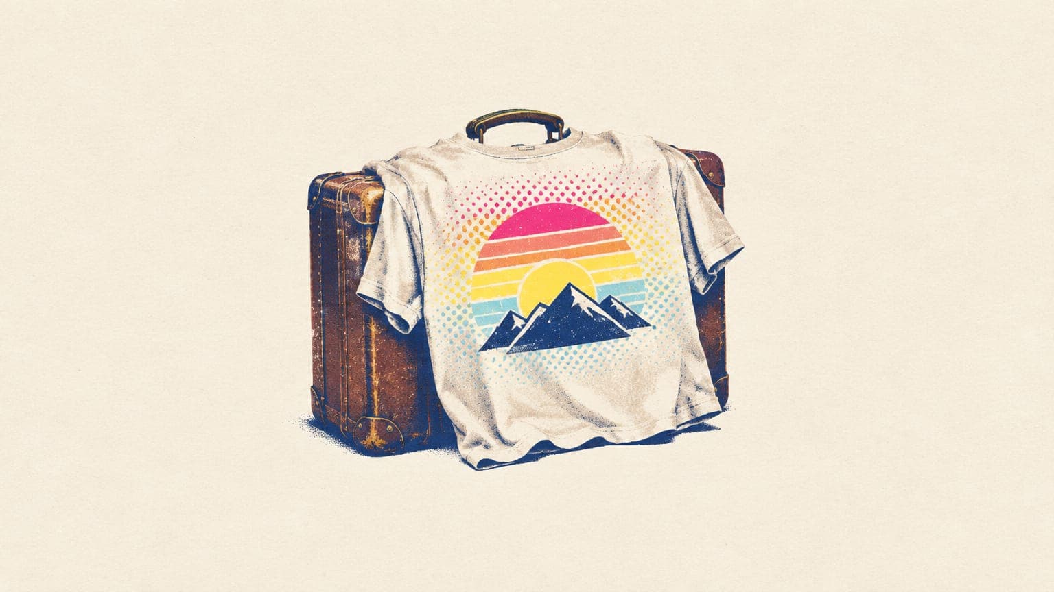
A vintage t-shirt design gets its look from five things: a muted, era-specific color palette, period typography, classic layouts like sunset stripes and round badges, halftone shading, and a worn, distressed texture. You can build all five in any design app or with an AI image generator.
The catch is printing. Distressed textures and soft shading are full of tiny, half-transparent specks, and DTG printers handle those badly, especially on dark shirts. This guide shows how to make a vintage t-shirt design that looks worn on purpose and still prints cleanly, with palettes, fonts and AI prompt templates you can use today.
Key takeaways
- Vintage comes from five ingredients: a muted palette, period fonts, classic layouts, halftones and distressing.
- Pick one decade and stick to it. 70s sunsets, 50s atomic shapes and 80s neon rarely mix well.
- Build distress and halftones from fully opaque dots and fully transparent holes. Half-transparent pixels print as specks or halos on DTG.
- Use fonts licensed for commercial use, such as Google Fonts released under the SIL Open Font License.
- “Vintage” doesn’t make old logos or characters free to use. Old trademarks can still be active.
The five building blocks of a vintage t-shirt design
Every convincing retro design uses some mix of these. You rarely need all five at once:
- A muted, era-specific palette. Three to five colors, usually a little warm and a little faded. Cream or off-white reads as older than pure white.
- Period typography. Fat 70s italics, western woodtype, 50s brush scripts or 80s chrome and neon lettering signal the era before anyone looks at the picture.
- Classic layouts. Striped sunsets, round badges with banners, arched lettering and travel posters are instantly familiar shapes.
- Halftone shading. Dot patterns instead of smooth gradients recall old screen printing and newsprint.
- Wear and texture. Cracks, specks and faded patches make a new print look like a shirt that’s been washed a hundred times.
A frequent mistake is mixing eras: an 80s neon grid behind a 1950s script under a 70s sunset reads as random rather than retro. Choose a decade, then pick every element from it.
Retro color palettes by decade
These palettes are starting points you can copy straight into a design app. Swap one color for your niche, but keep the overall mood.
| Era | Mood | Palette (hex) |
|---|---|---|
| 1950s diner and atomic | Cheerful, clean, mid-century | Turquoise #3FB8AF, cherry red #D7263D, cream #F3E9D2, mustard #E3B23C, charcoal #2E2E2E |
| 1960s surf and mod | Sunny, breezy | Sea teal #2A9D8F, sunshine #F4D35E, tangerine #EE964B, off-white #FAF0CA, navy #0D3B66 |
| 1970s sunset | Warm, groovy, earthy | Mustard #E1A730, burnt orange #D1603D, rust #9C3D23, olive #6B705C, cream #F4E4C1 |
| 1980s neon | Loud, electric | Hot pink #FF3C8E, electric purple #7A3CFF, cyan #29D4F5, sunset orange #FF8C42, midnight #1B1B3A |
| 1990s outdoors and athletic | Faded, rugged | Forest #2F4F3A, burgundy #7B2D26, gold #C9A227, faded black #3A3A3A, oatmeal #E6DCC8 |
| Western and rodeo | Dusty, sun-bleached | Saddle brown #8B5A2B, turquoise #40A4A0, sand #E8D5B0, rust red #A2412C, black #1E1E1E |
Original palettes for inspiration. Fabric shows colors less vividly than a screen, so order a sample of new color combinations.
Two print notes. Standard DTG inks can’t reproduce fluorescent colors, so bright 80s pinks and cyans usually print duller than they look on screen; test them before you build a collection around them. And the shirt color is part of the palette: a cream design on a vintage black tee, or a rust design on a natural tee, often looks more authentic than the same art on bright white.
Classic retro layouts that still work
These layouts are familiar because they’ve been used for decades. That’s the point: buyers read them as vintage at a glance.
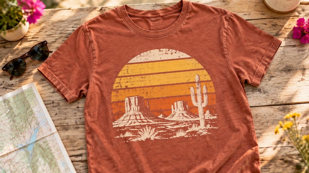
- Striped sunset circle. A sun with horizontal bands cut out of its lower half, with a silhouette in front: mountains, palms, a camper, a fish or any niche object.
- Round badge with a banner. An illustration inside a circle, with a ribbon across the bottom for a place name or a short phrase.
- Arched lettering over an illustration. The classic souvenir and athletic layout. Use your own word, never a school or team name.
- Stacked wavy type. Three or four lines of bubbly 70s lettering, often with echo outlines in two or three colors.
- Travel poster. A landscape in a rounded rectangle with flat bands of color for the sky and land.
- Chest stripes. Racing or ringer-style stripes across the chest, with a small emblem.
- Label or stamp. A worn rubber-stamp or product-label shape with a year and a simple icon.
- Rubber-hose mascot. A 1930s-style cartoon character with bendy arms and big shoes. Keep it original: anything resembling a classic studio mascot invites trouble.
Try this idea in POD Made Easy
“Retro striped 1970s sunset over desert mesas with a lone saguaro, round badge, mustard, burnt orange, rust and cream, flat colors, solid halftone shading, isolated on transparent background”
Halftones and distressing without ruining the print
This is where many vintage designs go wrong. DTG printers spray ink onto the shirt, and on dark garments they lay down a white underbase first so the colors show. They handle solid areas and fully transparent areas well. Pixels in between, the soft edges of a grunge brush or a texture set to 40% opacity, don’t behave predictably.
Printful’s print file guide puts it plainly: fully transparent areas disappear, anything in between may not print as expected, and on dark garments the underbase can show as small white speckles in semi-transparent areas. Its graphics team suggests halftones instead of semi-transparency. Here’s how to get the worn look without that risk:
- Make distress with holes, not opacity. Erase or mask the texture out completely (100%), so the shirt shows through. Never fade the artwork by lowering a layer’s opacity.
- Threshold your textures. Before using a grunge texture as a mask, convert it to pure black and white with a threshold adjustment, so it has no gray pixels left.
- Keep halftone dots solid. Each dot should be fully opaque ink. Shading comes from dot size and spacing, not transparency.
- Don’t go microscopic. At 300 DPI, a speck three pixels wide is about a hundredth of an inch on the shirt. Isolated specks that small add noise rather than texture, so keep texture details clearly visible at 100% zoom.
- Go easy on the lettering. Heavy distress can make letters unreadable at thumbnail size. Use a lighter version of the texture on text.
- Hunt for leftovers. Printful’s tip: duplicate the design layer several times in your editor. Faint, half-erased remnants become obvious when stacked.
DTF transfers handle fine detail differently from DTG, so if your provider prints your product with DTF, check its file guidance too; our comparison of DTG vs DTF printing explains the differences. For checking and fixing semi-transparent edges step by step, see our guide to transparent PNGs for t-shirts.
Vintage fonts that are free for commercial use
Typography does much of the work in a retro design. These Google Fonts suit vintage styles, and each is released under the SIL Open Font License (OFL) or the Apache License 2.0, both of which let you use the font in designs you sell:
| Font | Style and era | License |
|---|---|---|
| Shrikhand | Heavy italic display with a 70s feel | OFL |
| Fraunces | Soft, chunky serif with 70s warmth | OFL |
| Abril Fatface | High-contrast poster serif | OFL |
| Righteous | Rounded retro geometric | OFL |
| Monoton | 80s neon-sign inline lettering | OFL |
| Rye | Western woodtype | OFL |
| Alfa Slab One | Bold slab serif for badges | OFL |
| Pacifico | Surf-style script | OFL |
| Yellowtail | 1950s brush script | Apache 2.0 |
| Limelight | Art deco display | OFL |
| Special Elite | Worn typewriter | Apache 2.0 |
| Bungee | Vertical signage lettering | OFL |
Licenses checked in the Google Fonts repository in September 2026. Confirm the license wherever you download a font.
Download them from Google Fonts, and be wary of fonts labeled “free for personal use” on other sites: that label rules out products you sell. Our list of the best fonts for t-shirts covers more styles and the licensing traps in detail.
AI prompt templates for vintage designs
AI image tools are good at retro styles because the styles are well documented. Fill in the brackets, and leave the words out: you’ll get cleaner results setting the lettering yourself with one of the fonts above. You’ll also often get cleaner prints by generating the art without distress and adding your own texture mask afterward, where you control every speck.
- 70s sunset badge: [Subject] in front of a striped 1970s sunset inside a round badge, mustard, burnt orange, rust and cream, flat colors, thick outlines, solid halftone shading, isolated on a transparent background, no text
- Retro travel poster: Retro travel poster illustration of [landscape or landmark], [four colors], bold flat shapes, sun rays in the sky, rounded rectangle frame, transparent background, no text
- 1950s atomic: Mid-century illustration of [subject] with atomic starbursts and boomerang shapes, turquoise, cherry red, cream and charcoal, flat colors, clean edges, transparent background
- 1980s neon: 1980s retro illustration of [subject] over a striped sunset and a grid horizon, hot pink, purple, cyan and midnight blue, flat colors, no glow effects, transparent background
- Western rodeo: Vintage rodeo poster illustration of [subject], woodcut shading, saddle brown, turquoise, sand and rust, flat colors, transparent background
- Rubber-hose mascot: Original 1930s rubber-hose cartoon character of a smiling [object] with bendy arms, black, cream and red, thick outlines, flat colors, transparent background
- Antique engraving: Antique engraving of [subject] with crosshatch shading, one color [color], no paper texture, transparent background
Note the “no glow effects” in the neon template: glows are soft, semi-transparent pixels by definition. For 100 more ready-to-use prompts, see our list of AI prompts for t-shirt designs.
Try this idea in POD Made Easy
“Original 1930s rubber-hose cartoon of a smiling coffee cup with bendy arms and big shoes, black, cream and red, thick outlines, flat colors, isolated on transparent background”
Retro looks, print-safe files
POD Made Easy turns your vintage idea into a vector or clean transparent PNG at your product’s exact print size, checks the file for resolution and clean transparency, and spell-checks any AI lettering before you publish.
Start your free trialShirt colors and blanks that suit retro designs
The blank does a lot of the vintage work before you print anything:
- Garment-dyed and washed tees have a soft, faded look that matches retro art, and they’re often priced higher than basic blanks.
- Natural, cream and heather colors make designs look aged without any texture at all.
- Vintage black and faded navy suit light, distressed artwork, since the shirt shows through the texture.
Whatever you choose, keep strong contrast between the design and the shirt, and offer the colors that suit each design rather than every color in the catalog. Our guide to best-selling t-shirt colors covers how many colors to offer per listing.
“Vintage” doesn’t mean free to use
Old doesn’t mean expired. Trademarks can last as long as they’re in use, and many brands, sports teams and companies still own and enforce their classic logos, mascots and slogans. A “vintage” version of a soda ad, a retro team logo or an old cartoon character can get a listing removed just as fast as the modern one.
- Create your own vintage-style emblems, mascots and place names instead of reviving real ones.
- If you want genuinely old artwork, use images that are truly in the public domain and add your own design work; our guide to public domain images for print-on-demand explains the rules.
- Search any wording in a trademark database, and read our guide to avoiding trademark infringement in POD.
Pre-print checklist for retro designs
- The palette uses three to five colors from one era, with no stray gradients or glows.
- Every halftone dot and distress speck is fully opaque, and every hole is fully transparent.
- Edges are clean at 400% zoom, and the duplicate-layer test shows no faint leftovers.
- Lettering is still readable at thumbnail size after distressing.
- Fonts are licensed for commercial use, and you’ve saved a copy of each license.
- The PNG matches the print area exactly (4500 × 5400 px for a standard full front) with a transparent background.
- You’ve previewed it on the real shirt color and ordered a sample of any new style.
- No real brand, team or character marks appear, and any phrase has been searched.
Need a subject to put inside that sunset? Browse our t-shirt design ideas by niche and give one of them the vintage treatment.
Frequently asked questions
- Do distressed designs print well on DTG shirts?
- They can, if the distress is made of fully transparent holes and fully opaque specks. Textures built with soft brushes or lowered opacity leave half-transparent pixels, which DTG printers can turn into blotches or pale speckles, especially on dark shirts.
- What file format is best for a vintage t-shirt design?
- A PNG with a transparent background at your provider’s exact print-area size, such as 4500 × 5400 px for a standard full front. If you work in vector, keep the SVG as your master and export the PNG from it.
- What is a halftone in t-shirt design?
- A halftone is a pattern of solid dots that fakes shading: bigger or denser dots read as darker areas, smaller or sparser dots as lighter ones. Because each dot is solid ink, halftones print more predictably than soft gradients or semi-transparent shading.
- Can I sell designs that look like old brand logos or ads?
- Not safely. Age doesn’t end a trademark, and many brands still own and enforce their classic logos and mascots. Create your own vintage-style marks instead, or use artwork that is genuinely in the public domain, and search any wording in a trademark database.
- Should I buy pre-distressed textures or make my own?
- Either works if the license covers products for sale. Check that the texture’s license allows commercial use on merchandise, then convert it to pure black and white before using it as a mask, so it leaves no half-transparent pixels.
Keep reading
More design guides
Design
100 AI Prompts for T-Shirt Designs That Print Well
100 original AI prompts for t-shirt designs, sorted by style and niche, plus a simple prompt formula and print-safe add-ons that work in ChatGPT or Midjourney.
Sep 24, 2026 · 19 min read
Design
Best Fonts for T-Shirts: 38 Free for Commercial Use
The best fonts for t-shirts that are free for commercial use: 38 Google Fonts checked for OFL or Apache licenses, by style, plus pairing and legibility tips.
Sep 24, 2026 · 14 min read
Design
How to Design T-Shirts With AI That Sell (2026 Workflow)
How to design t-shirts with AI that sell: pick a buyer, write prompts that print well, draft cheaply, make a print-ready final, proofread and build on winners.
Sep 24, 2026 · 11 min read